How I Built Software Around Two Busy Admins
Most B2B SaaS is built for an ideal world of uninterrupted focus. Real enterprise environments are chaotic. Discover how observing real users changed my approach to system architecture and enterprise UX.
When I sit down to architect a custom ERP or CRM for a high-volume client, I don’t start by looking at database schemas, API routes, or serverless infrastructure.
I start by watching the admins.
I watch them interact with customers while simultaneously checking live inventory on their mobile phones. I watch them get interrupted mid-keystroke to answer a sudden pricing question from a junior employee. I watch shift changes where critical operational information is haphazardly passed along via sticky notes attached to monitors.
Most B2B SaaS software is built for an ideal world where a user sits quietly at a desk for 8 hours with absolute, uninterrupted focus. Real retail and enterprise environments are chaotic, loud, and constantly shifting.
I don't design software for perfect users. I design it for busy people.
Here is what observing real users taught me about system architecture, and how those lessons completely changed the trajectory of the enterprise software we build at Webshastraa.
---
1. Every Click Costs Money
The Observation:
In a high-volume environment, milliseconds matter. If an administrator has to click four times through nested sidebar menus to find a customer’s previous order, that is friction. If they perform that action 50 times a day, that is quantifiable lost revenue and wasted labor.
The Engineering Decision:
I noticed that admins almost never navigated the sidebar once they learned the system. They remembered regular customers, specific order numbers, and SKU prefixes—not arbitrary menu hierarchies.
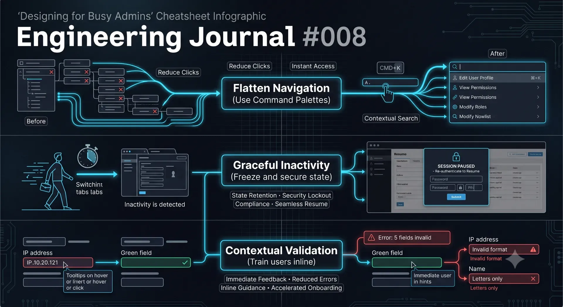
That observation completely changed how I architected the frontend state. Instead of asking users to hunt for features, the software should allow them to search for what they are already thinking about. We flattened the navigation hierarchy entirely by implementing a global "Omnibar" (a Cmd + K command palette). By indexing routes, customers, and active orders into a unified search state, the most critical actions were brought exactly one keystroke away.
---
2. Admins Don’t Read Manuals
The Observation:
If your enterprise software requires a 30-page PDF manual to operate, you have failed at UX. Admins do not have the time to read documentation while a customer is waiting in front of them; they need the software to guide them intuitively.
The Engineering Decision:
In finance and inventory, one accidental extra zero can turn a ₹5,000 transaction into a ₹50,000 disaster. I realized the backend validation architecture shouldn't simply accept every number that matches the integer data type. It should question values that violate business logic.
Validation isn't just about preventing SQL injection; it's about context. When our system detects an anomaly (e.g., a discount exceeding the standard 15% margin), it doesn't just throw a generic 400 Bad Request error. It catches the anomaly, isolates it at the UI layer, and provides a plain-English, actionable warning to the user before the database mutation occurs. The software actively trains the user in real-time.
---
3. Reduce Typing at All Costs
The Observation:
Typing on a mobile device while walking a showroom floor and talking to a VIP customer is a recipe for bad data entry.
The Engineering Decision:
If a user has to manually type the exact same complex word twice in one week, the architecture has a flaw. We heavily utilized contextual memory and fuzzy searching in our database queries.
When processing bulk data imports or tagging inventory, our system remembers typo aliases. If an admin previously mapped an incorrect category name to the correct one, the system permanently stores that alias mapping in the database. By integrating localized autocomplete and heavy client-side caching, admins can select complex tags, materials, or preferences with a single tap rather than typing them out manually. We shifted the computational burden of spelling from the human to the server.
---
4. Automate Everything (Especially the Boring Stuff)
The Observation:
Humans are terrible at repetitive, algorithmic tasks. Computers excel at them. Every time I found an administrator minimizing the dashboard to open Microsoft Excel or reaching for a physical calculator, I treated it as a massive red flag that our software was failing them.
The Engineering Decision:
Repetitive calculations are exactly the kind of workload serverless functions should perform. In industries where supplier costs or precious metal rates fluctuate daily, expecting an admin to manually update thousands of product prices is absurd.
Instead of building a UI for manual bulk updates, we architected background CRON jobs. The backend silently polls live market data APIs, caches the rates in memory, and mathematically calculates the final retail price of every item dynamically at the edge. The admin simply opens the dashboard, and the prices are already perfectly accurate.
---
5. Design for Interruptions
The Observation:
This was the biggest paradigm shift in my engineering career. A floor admin will walk away from their screen in the middle of a complex transaction to help a customer. It is inevitable.
The Engineering Decision:
When standard software detects a period of inactivity, it ruthlessly destroys the JWT session, logs the user out, and deletes all their unsaved form data. This causes immense frustration.
We engineered a system for graceful degradation. When the system detects inactivity, it serializes the active application state (including half-filled text inputs) and securely stores it in the browser's encrypted local storage. It then locks the UI. When the admin returns to their desk, they simply authenticate via a PIN, the state is rehydrated, and they are exactly where they left off—mid-keystroke.
Furthermore, to eliminate the chaotic sticky notes on monitors, we integrated asynchronous inter-shift communication directly into the operational dashboard.
---
The Best Feature Is the One Nobody Notices
The highest compliment an engineer can receive is silence.
The best enterprise features are usually entirely invisible. Nobody walks into an office excited about automated audit logs, state-recovery systems, optimistic UI updates, or background database backups. They only notice them the day something goes catastrophically wrong.
That is when invisible engineering becomes highly visible.
Conclusion
The biggest lesson I learned building enterprise dashboards wasn't about React, Next.js server actions, or complex MongoDB aggregations.
It was about people.
Great enterprise software isn't built around databases. It isn't built around REST APIs. It isn't even built around features. It is built strictly around the daily habits of the people who depend on it for their livelihood.
Every unnecessary click steals a few seconds of their time. Every interruption breaks their concentration and forces them to start over. Every confusing screen increases the statistical chance of a financial mistake.
Good software doesn't ask busy people to change how they work. It quietly, intelligently adapts to the way they already do.
---
💡 Key Engineering Takeaways
Frequently Asked Questions
What is enterprise software UX?
Enterprise software UX (User Experience) focuses on designing interfaces for highly complex, data-heavy B2B applications. Unlike consumer apps designed for engagement, enterprise UX prioritizes speed, accuracy, data density, and reducing operational friction for employees who use the software for 8 hours a day.
Why is traditional sidebar navigation often inefficient in enterprise apps?
In high-volume environments, clicking through multiple layers of nested sidebar menus slows down power users. Advanced enterprise UX often replaces or augments sidebars with command palettes (Omnibars) that allow users to jump instantly to specific customers, orders, or actions using keyboard shortcuts.
How should enterprise software handle user inactivity?
Instead of ruthlessly logging a user out and deleting their unsaved work (which causes frustration during inevitable office interruptions), modern systems should freeze the application state, securely cache the unsaved data locally, and lock the screen. Upon re-authentication, the user resumes exactly where they left off.
Why is manual data entry considered an architectural flaw?
Manual typing on mobile devices or in fast-paced environments inevitably leads to typos, corrupted data, and wasted time. Systems should minimize typing by utilizing intelligent defaults, contextual memory, alias mapping, and single-click autocomplete features.
How can software reduce the need for employee training manuals?
Software should utilize context-aware, inline validation. Instead of letting a user submit a form and returning a generic error code, the UI should evaluate business logic in real-time, catching anomalies and explaining exactly how to fix them in plain English before the submission occurs.
Feedback