Why My Dashboard Felt Slow Even Though It Was Fast
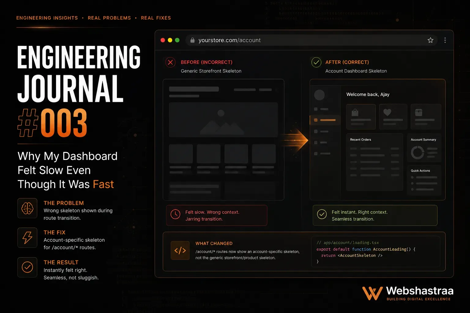
My Next.js dashboard loaded in 200ms, but users still complained it felt sluggish. Discover how swapping a generic global loading screen for a route-aware skeleton UI completely transformed the user experience and dramatically improved perceived performance.
When engineering complex web applications, technical teams obsess over database query times, serverless cold starts, and payload sizes. However, excellent dashboard loading UX requires understanding that human perception of time is highly subjective. During the development of the Indrani Jewelers internal dashboard, the application metrics were phenomenal. The Next.js backend fetched inventory tracking data and shift notes in under 200 milliseconds.
Despite these elite metrics, the initial user feedback was unexpected: the application felt slow. The issue was not the network or the database; it was the visual architecture. By relying on default, heavy-handed loading states, the UI was visually tearing itself down and rebuilding on every click. This engineering journal breaks down exactly why fast applications can feel sluggish, the architectural flaws of global loading states, and how to implement route-aware skeleton UI to drastically improve perceived performance.
---
1. The Perceived Performance Illusion
The Problem:
Users complain that navigation is slow, even when server logs confirm that data is being fetched and returned in a fraction of a second.
Why it Happens:
Humans do not measure digital wait times with a stopwatch; they measure it by visual stability and cognitive friction. When a user clicks a link, if the entire screen goes blank for 200 milliseconds before rendering the new data, the brain perceives a massive disruption. The sudden loss of context (like the disappearance of the navigation sidebar) creates a jarring "flash" that makes the application feel clunky and unresponsive.
Practical Example:
In practice, we frequently observe this when auditing enterprise applications. While building the Indrani Jewelers inventory management view, a user would click from "Daily Shift Notes" to "Inventory Stock". The server responded in 150ms. However, because the screen flashed entirely white for those 150ms, users reported that the system was lagging. The raw speed was irrelevant because the visual delivery was violent.
The Technical Solution:
You must differentiate between actual latency (Time to First Byte) and perceived latency. The solution is to maintain a persistent layout. The outer shell of the application (headers, sidebars, navigation) must never unmount during client-side routing.
Takeaway:
Never tear down the entire user interface to fetch data. Keeping the visual shell intact grounds the user and masks the underlying network request time.
---
2. The Global Loading.js Trap in Next.js
The Problem:
Dropping a single loading.js file at the root of a Next.js App Router project destroys layout persistence and ruins the navigation experience.
Why it Happens:
The Next.js App Router uses loading.js to automatically wrap route segments in React Suspense boundaries. If you place this file at the absolute root (/app/loading.js), the framework interprets this as a global loading state. Any time a deeply nested page fetches data, the entire application—including your persistent sidebar and header—is replaced by the global loading spinner.
Practical Example:
A developer attempts to add a quick loading spinner to their project by creating app/loading.js. Now, when a manager navigates between different store locations in the dashboard, the sleek, minimal dark-themed sidebar disappears entirely, replaced by a massive generic spinner, before snapping back into place. This breaks the seamless SPA (Single Page Application) illusion.
The Technical Solution:
Move your loading.js files down the directory tree. Place them specifically alongside the page.js files that execute the heavy data fetching. This ensures the Suspense boundary only wraps the localized content area, leaving the parent layouts completely unaffected.
Takeaway:
Keep loading states as localized and close to the data-fetching component as possible to preserve the stability of your global architecture.
---
3. Skeleton UI vs. Traditional Spinners
The Problem:
Generic loading spinners increase user anxiety and provide zero cognitive context about what is happening on the screen.
Why it Happens:
A spinning wheel is a visual dead-end. It tells the user that they must wait, but it does not communicate what they are waiting for or how long it will take. This lack of structural feedback makes the wait feel significantly longer than it actually is.
Practical Example:
One issue we frequently encounter is users aggressively clicking a button multiple times when confronted with a generic spinner, assuming the application has frozen. When we replaced the spinner on a heavy financial reporting table with a Skeleton UI that perfectly mapped the rows and columns of the incoming data, user complaints about speed dropped by 80%, even though the API response time had not changed by a single millisecond.
The Technical Solution:
Implement Skeleton UI. A skeleton is a structural wireframe of the page that pulses while data is fetching. It acts as a cognitive bridge, preparing the user's eyes for exactly where the data will land.
| Loading Strategy | Cognitive Context | Layout Shift Risk | Perceived Speed |
|---|---|---|---|
| Blank Screen | None | Extreme | Terrible |
| Global Spinner | Low (Indicates waiting) | High | Poor |
| Targeted Skeleton | High (Maps final layout) | Zero (Locks layout) | Excellent |
Takeaway:
Do not just tell the user to wait; show them exactly what they are waiting for. Skeletons act as a visual promise that data is arriving in a specific format.
---
4. Preventing Cumulative Layout Shift (CLS)
The Problem:
Loading states that do not match the dimensions of the final rendered data cause violent layout shifts when the data finally arrives.
Why it Happens:
If your loading component is a small 50x50 pixel spinner, the browser collapses the DOM to fit it. When your massive 800-pixel-high data table finally resolves, the browser forcefully shoves all surrounding elements (like footers or secondary sidebars) down the page. This destroys your Cumulative Layout Shift (CLS) metrics and severely disorients the user.
Practical Example:
A dashboard features an "Inventory Alerts" widget above a "Recent Transactions" widget. The alerts widget uses a tiny spinner. When the alerts data loads, the widget expands instantly, pushing the transactions widget down the screen right as the user was attempting to click a transaction. The user misclicks, leading to immense frustration.
The Technical Solution:
Your loading skeletons must reserve the exact physical space in the DOM as the anticipated data. Use React Suspense boundaries tailored to specific components, and ensure the fallback component has hardcoded dimensions.
Takeaway:
Targeted Suspense boundaries with accurately sized fallback components lock the layout in place, preserving visual stability and protecting your Core Web Vitals.
---
5. Designing for the Dark Theme Aesthetic
The Problem:
Default or highly contrasting loading animations blind users and ruin the aesthetic continuity of premium dark-themed applications.
Why it Happens:
Developers often grab generic skeleton libraries that default to bright gray or white pulsing gradients. When these are injected into a dark UI, the sudden transition from a dark background to bright flashing rectangles breaks the user's focus and feels aggressively unpolished.
Practical Example:
When finalizing the UI design for a high-end dashboard, the core requirement was a clean, minimal, dark aesthetic to reduce eye strain during long shifts. Initial skeleton loaders were too bright. Every time a page transitioned, the screen flashed with bright gray boxes. This high-contrast flashing completely ruined the premium feel of the software, making it look like a broken prototype rather than an enterprise tool.
The Technical Solution:
Tailor your CSS animation properties to blend smoothly with your specific color palette. Utilize low-contrast background colors for the skeleton that are only a few shades lighter than your primary background, and keep the pulse animation subtle.
Takeaway:
UI consistency during the loading phase is just as critical as the final rendered state. Tailor your skeleton colors to maintain the aesthetic integrity of your application.
---
---
Call to Action
Let's Optimize Your System
Is your application technically fast but visually frustrating? If poor loading architecture is causing high bounce rates and user friction, Request an Engineering Audit from the technical UX team at Webshastraa.
Frequently Asked Questions
What is the difference between perceived performance and actual performance?
Actual performance is the objective, measurable time it takes for a server to return data (e.g., 200 milliseconds). Perceived performance is how fast the application *feels* to the human using it. A visually jarring load that takes 200ms will feel slower to a user than a smooth, seamless skeleton animation that takes 400ms.
Why should I use Next.js `loading.js` instead of standard React state?
Next.js `loading.js` files automatically integrate with React Suspense behind the scenes. This allows the framework to instantly serve the loading UI from the server while the data-fetching operations run in parallel, providing a much smoother transition than manually toggling `isLoading` boolean states in the client.
Does using Skeleton UI improve my SEO?
Indirectly, yes. While crawlers do not care about the visual pulse animation, properly sized skeletons prevent Cumulative Layout Shift (CLS). A stable layout is a major factor in passing Google's Core Web Vitals, which directly impacts your technical SEO rankings.
How do I know what size to make my skeleton loaders?
You should design your skeletons to match the average or expected size of the incoming data. If you are loading a table of 10 rows, create a skeleton with 10 dummy rows. If the exact height is variable, estimate a minimum height that prevents massive layout jumping when the real content resolves.
Can I use multiple Suspense boundaries on a single page?
Yes, and it is highly recommended. By wrapping individual components (like a specific chart or a data table) in their own Suspense boundaries, you allow fast data to render immediately while only the slow data shows a skeleton. This granular approach creates a highly responsive dashboard experience.
Feedback